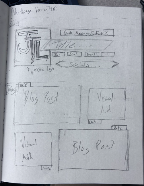
When creating this blog, I went through a variety of changes and ideas before putting what is here now together. I drew inspiration from a host of different sources, media, and aspects of my life that I wanted to be present in my blog. My goal was to personalize this page to feel like an extension of myself into the digital world. As shown here on the left, my first draft for the home page is pretty accurate to how it spatially is now. This was in part to my customized logo I spent time in photoshop crafting. This sketch served as a foundation to how to block my page, and the grouped blocks of text and visuals in on display right here!
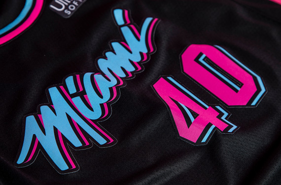
One of the biggest components to a good graphic design in my opinion is the color palate of a piece. I was inspired by the Miami Vice aesthetic and its accompanying color way of a bright pink mixed with a nice blue all on top of a dark black background. The main inspiration behind that is the Miami Heat’s 2018 season city edition jerseys as pictured here. I absolutely love this color combination and believe is catches a persons attention while being bold but using naturally soft colors.
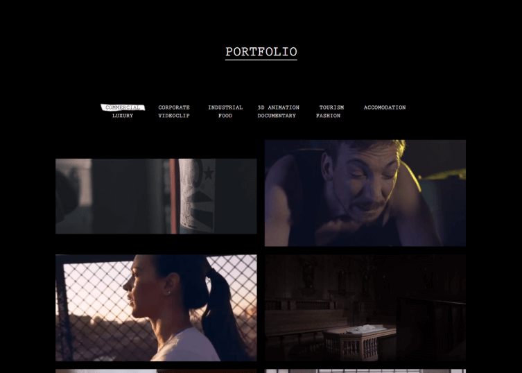
After some research into blog’s overall designs, I found that I leaned more towards simplistic/minimalistic designs such as the portfolio displayed on the left. I tend to be minimalistic on the surface, not usually caring about my appearance or what others may think about me, however when I truly open up I am more flashy than I let on. I think this is represented in the juxtaposition of Miami vice coloring with a basic layout, once again reflecting myself in my blog. I want the themes of my blog to reflect a calming party, a sort of orderly chaos, a totally oxymoron, but I believe sometimes I am just that as well.
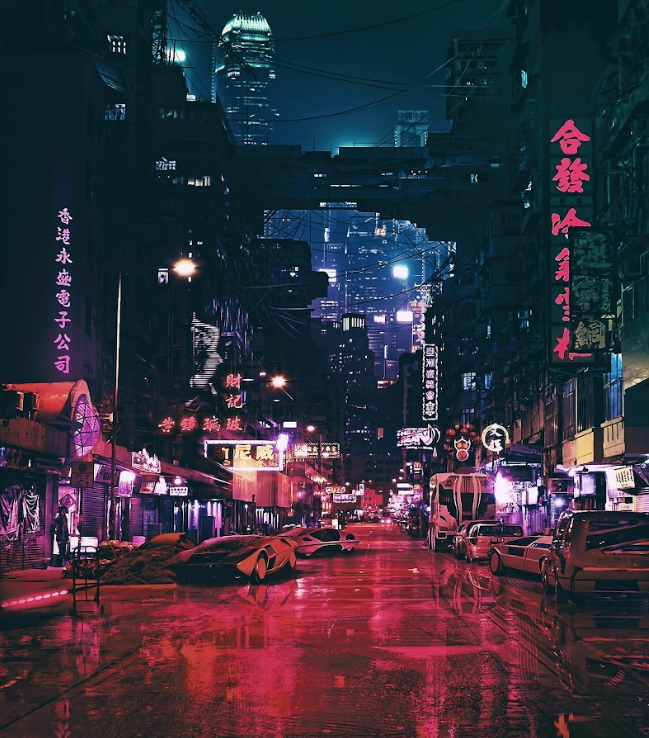
I also wanted to display elements of the science fictional concept of neo-cities, specifically that of neo-Tokyo. This aesthetic has been displayed in media such as the film Blade Runner, and the recent video game Cyberpunk 2077. This concept in the new(er) take on how futuristic cities may look compared to the retro-futurism displayed in older media such as the television cartoon The Jetsons. This aesthetic is most prominently displayed in my logo, showcasing neon lights and a dragon symbol. I believe, as with my previous thought, this shows that sort of orderly chaos that I wanted to display to viewers of the sight. Although this site was hard to craft, it is not perfect, much like our society.
Leave a Reply